TECH-witches and traveling the expanse
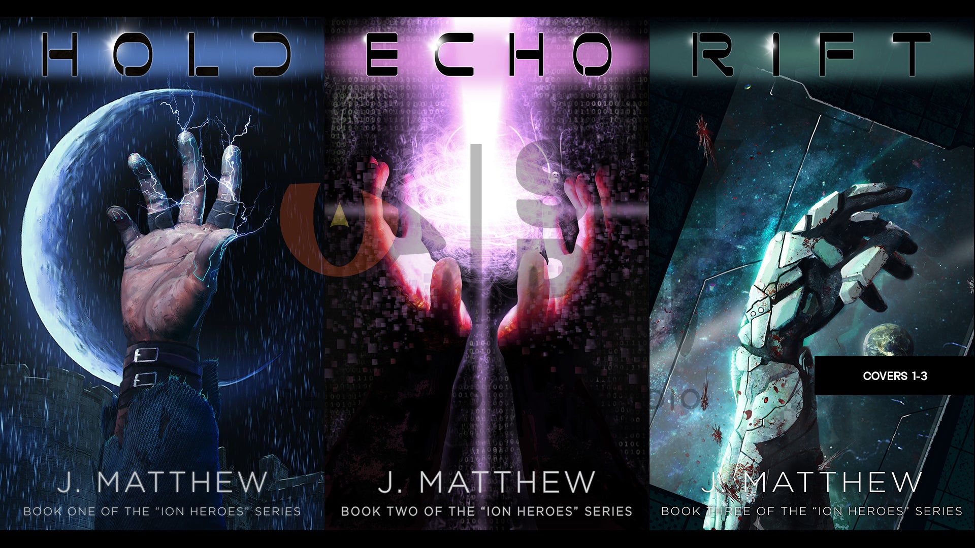
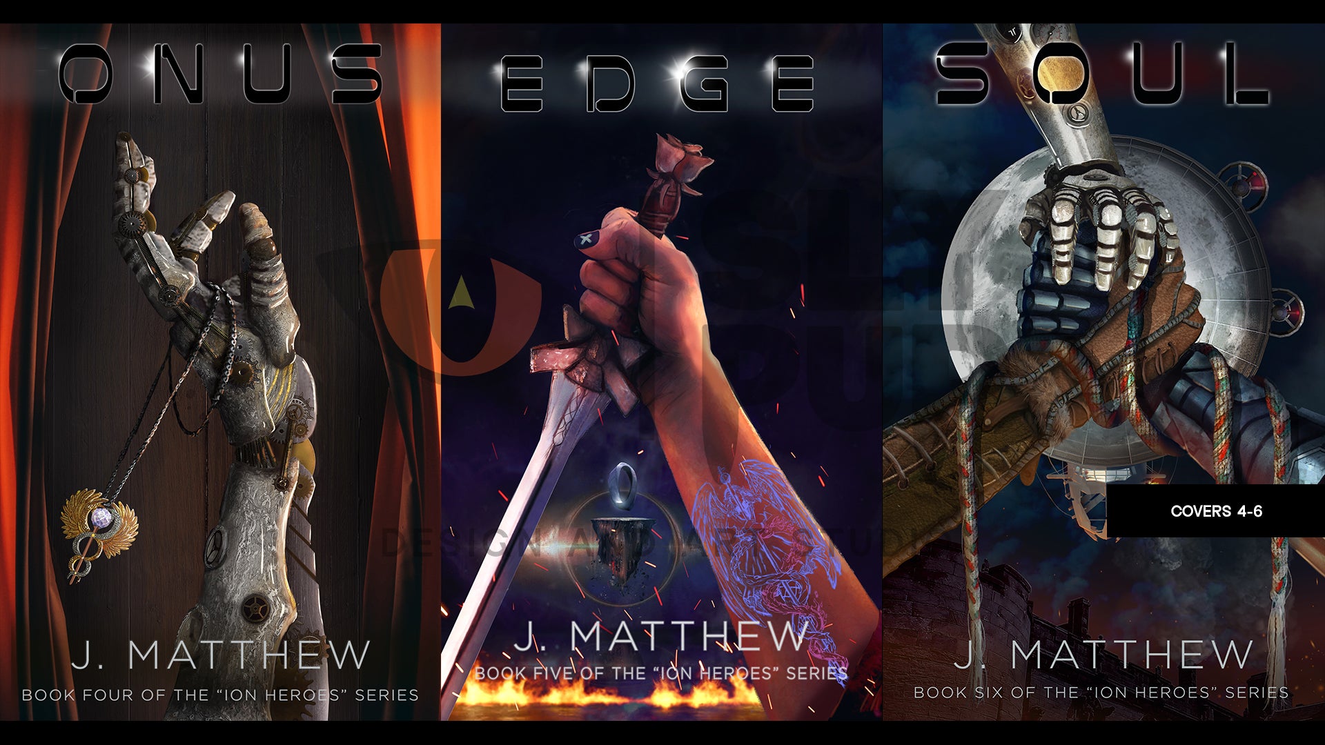
The Ion H.E.R.O.E.S. series presents a hauntingly beautiful vision of Earth's future—a world once propelled by cutting-edge technology, now reduced to a quasi-Medieval state where machinery is heresy and whispers of the past echo in the feared TechWitch's domain. In this richly woven narrative, humanity grapples with the remnants of its own hubris, and the visual design of the book covers captures this dichotomy with elegance and grit.
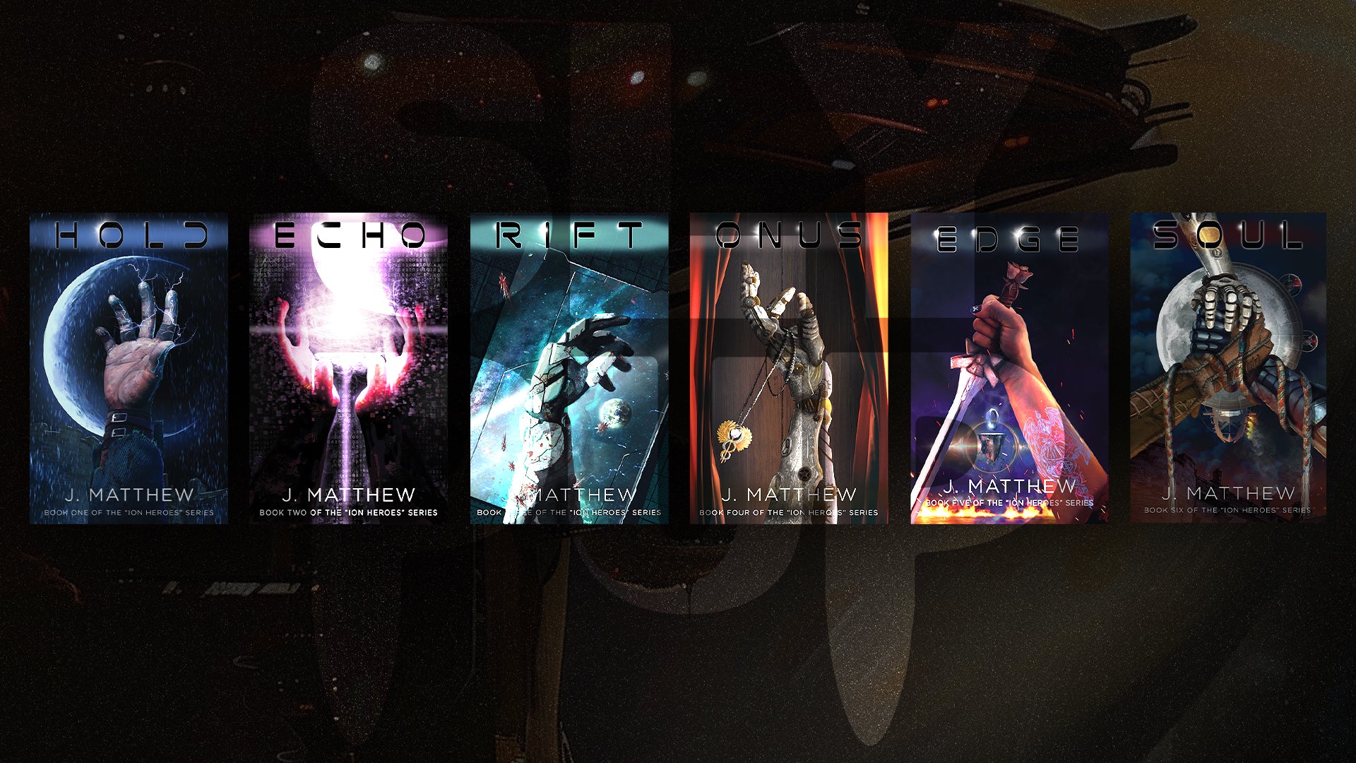
Hands Reaching Across Worlds: By using hands as the focal point, the series challenges traditional expectations of sci-fi and fantasy cover art, —literal, expressive, and symbolically powerful. These hands convey a broad range of emotions: determination, hope, strength, and a touch of the divine. presenting a subtle yet impactful way to lure readers into a world that feels both alien and human. The covers achieve what few series manage: they create a visual language that encapsulates the heart of the story, making the series unforgettable at a glance.
This visual motif of hands reaching or grasping is both personal and universal, grounding the story's epic scale in something as intimate as human touch. Juxtapose this against backgrounds that hint at a larger cosmos or the worn textures of a more grounded, Medieval Earth to conveys the series’ fundamental tension: a society striving to reclaim its history, caught between the organic familiarity of Earth and the cold, lost grandeur of a technologically advanced solar system. The covers invite readers into a story that is both tactile and cosmic, balancing the familiar with the unknown.
Contrasts in a Fragmented Future: The color palette is dark and moody, dominated by deep colors, blacks, and fiery highlights that hint at both the coldness of space and the warmth of fire. The contrasts are bold, symbolizing the dual worlds the series bridges. Each cover evokes a feeling of mystery, darkness, and suspense, pulling readers into a realm where knowledge is both a curse and a power. The lighting across the covers also adds a dramatic intensity—illuminating the hands with an almost otherworldly glow that suggests forces beyond human control or comprehension.
These color choices contribute to the series’ distinct aesthetic: one of a post-apocalyptic future grounded in mythic storytelling. The dark tones communicate a sense of foreboding and weight, aligning with the themes of survival, lost knowledge, and ancient power. Readers are immediately drawn into a story that is as much about endurance and strength as it is about discovery and transformation.
Symbolic Minimalism with Depth: While the covers may seem minimal in design, their simplicity is their strength. Each image is carefully crafted to communicate complex themes without overwhelming the viewer. This minimalist approach focuses on a single image—the hand—allowing the viewer to project their own emotions and interpretations onto the cover. The hands are adorned with elements of both high-tech and medieval symbolism, a clever nod to the series' hybrid setting where the past and future collide. The result is a powerful, almost iconic style that stays with the reader, suggesting that each book is a step in a grander narrative.
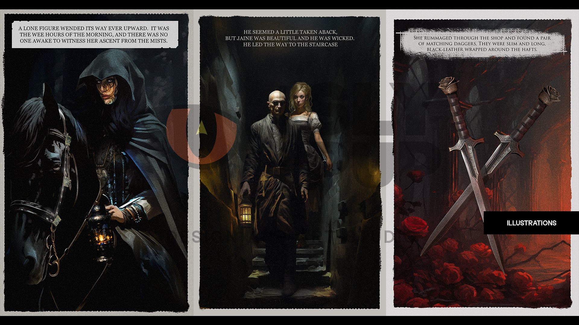
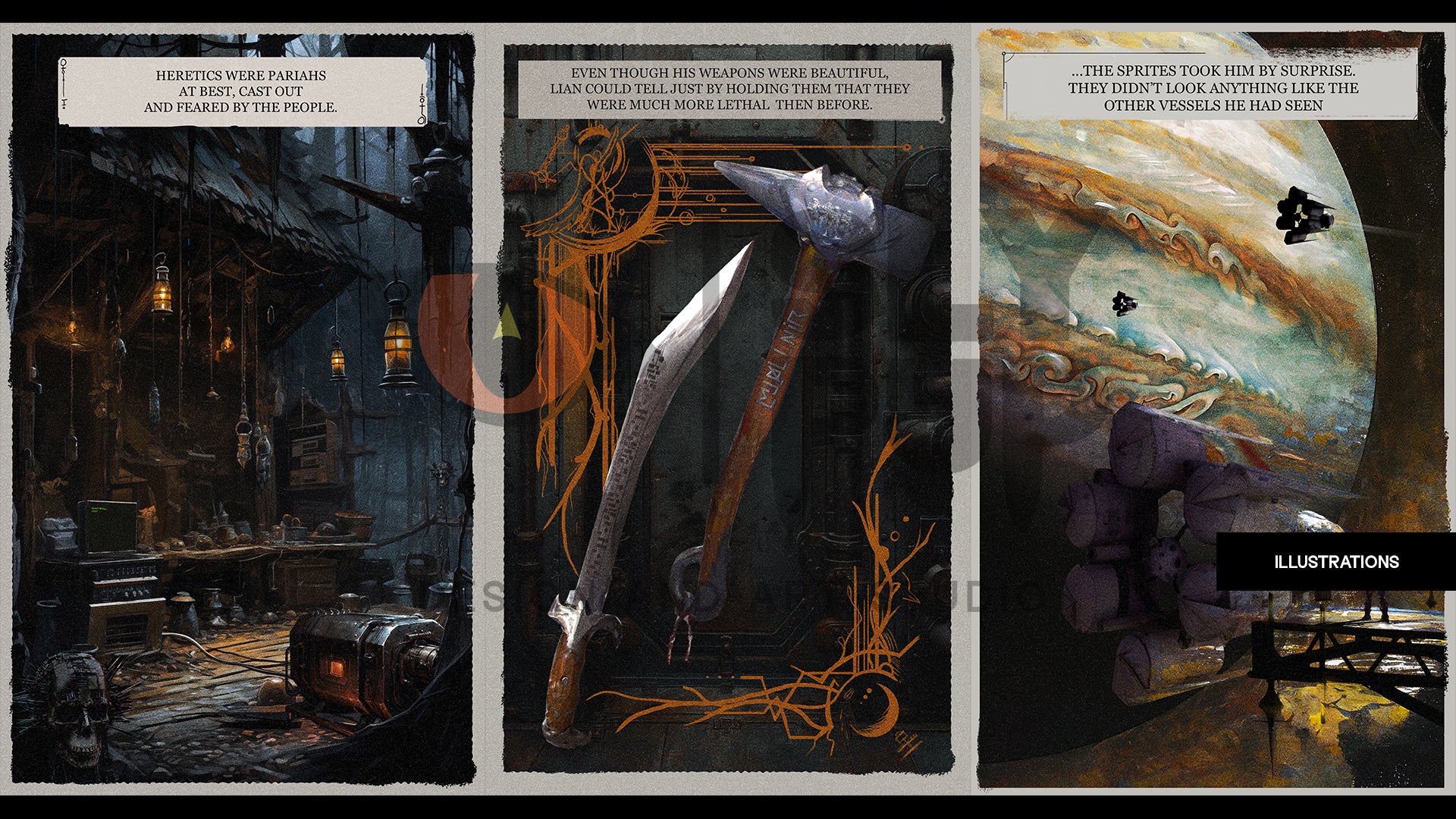
Drawing Readers into a Universe of Myth and Mechanism: The Ion H.E.R.O.E.S. covers stand out for their unique approach to depicting a science-fantasy world. It’s a visual style that leaves a lasting impression, emphasizing the tension between myth and machine, ancient power and modern ruin. Rather than overwhelming readers with scenes of high-tech cities or medieval battlegrounds, we opted for a more introspective view. The art promises an epic story told through the lens of personal struggle, loyalty, and survival—elements that resonate deeply with the viewer even before they turn the first page.
These covers are a testament to thoughtful, impactful design, combining thematic resonance with visual simplicity ,promising a journey that is at once intimate and epic.